
The outer shell is new, information is easier to find, more clearly presented. And then … same old, same old.
By David Enna, Tipswatch.com
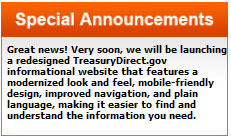
If you’ve visited everyone’s favorite financial website — TreasuryDirect.gov — in the past few days, you might have noticed an important message on the homepage: A redesign is coming! And today … it launched.
The TreasuryDirect site is almost universally ridiculed, especially by new investors who have been piling in recently to load up on U.S. Series I Savings Bonds. I’ve been using this site for about 20 years and I’m comfortable with its quirks. But I still tell people, “It will remind you of MySpace.”
To be honest, the site never bothered me much. I used it. Most of the time it worked. I knew where to go and do what I had to do. But that came from 20 years of using it.
The biggest complaints I hear from readers concern difficulties in account creation and logging in, and unfortunately, the new design does nothing to solve those issues (at this point). Is more coming? I can’t say because TreasuryDirect has not formally announced the redesign. Its news section has no items posted in October and no mention of the redesign.
“Improving the front-end informational pages on TreasuryDirect.gov enhances the user experience by helping customers more easily find the information they’re looking for and improving the website’s information quality, appearance and usability,” a Treasury spokesperson told CNBC.
CNBC also noted the Treasury said it has “more than doubled call center resources and made other technical enhancements” in response to investors struggling to get answers on the site.
Let’s take a walk through the new look … and the old look hidden inside:
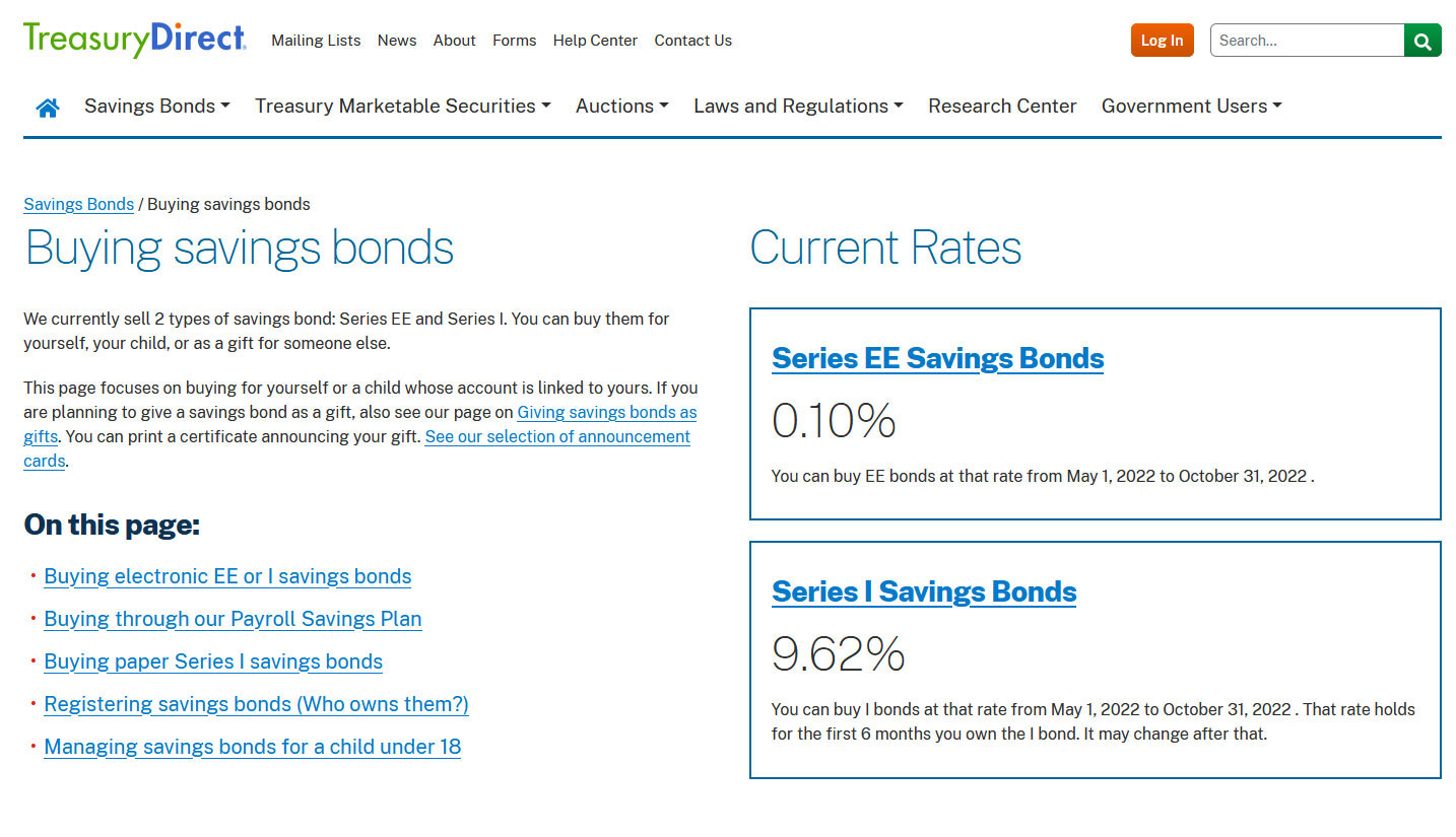
The new homepage
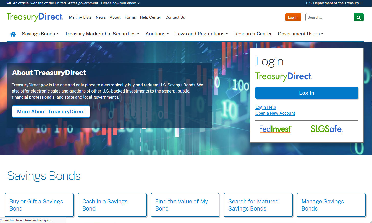
I worked on a newspaper website for more than 20 years, and my impression of this design is that it is unfocused and needlessly busy. But on the positive side, the type is larger and I like the font. I love the very prominent presence of Savings Bonds links “above the fold.” This shows a strong commitment to the Savings Bond program.
The login page

Hey, that looks familiar! Yes, you jump back in time to the old site design’s login page, which is probably a good thing. It works exactly the same way, meaning you won’t have to reestablish credentials to log in to your account. After you enter your account number, you get this:
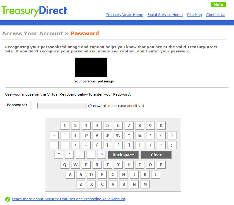
It’s the virtual keyboard, and TreasuryDirect is the only site I have ever seen that uses one. This login method triggers hilarity around the financial internet, but I am saying: I LIKE IT. TreasuryDirect is taking this step to keep your password safe from keystroke tracking spyware, also called “keyloggers.” I want TD to take every step possible to protect my account.
Account summary page

Again, this is a holdover from the old site. And there at the top is the “important message”: Do not use your browser’s back button on TreasuryDirect. If you do, you will be bumped out and have to log in again. Instead, use the “return” button at the bottom left of each page. Not sure why this is necessary, but it is what it is.
The back button issue only applies when you are logged into TreasuryDirect and looking at your account information. The back button works fine everywhere else on the site.
The BuyDirect page

Again, this is exactly as it was on the old site. No changes.
Current Holdings page
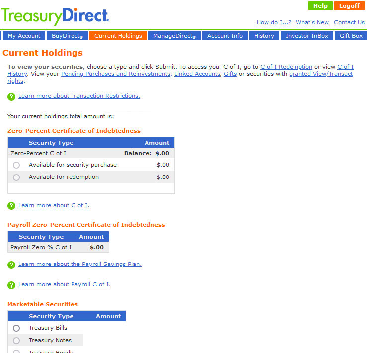
Nothing new here. Same as always.
So what’s new?
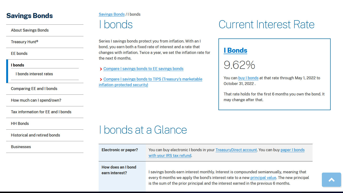
The folks at TreasuryDirect have been working hard to improve the site as an “informational” resource, creating new, more scannable guides to buying Savings Bonds, for example. Some screenshots:
—————————————–

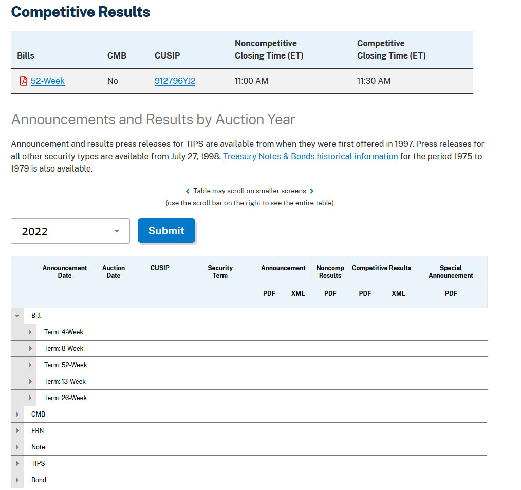
Auction results
I use TreasuryDirect several times a week to check on auction results for TIPS and T-bills. The same functionality is on the new site, but the look is updated. This morning, when I tried to see the 1-year T-bill auction result, I got nothing. The page never finished loading the results portion, which also happened often on the old site. Later, it worked. I would really like this to work, every time. This is the opening page.

Click on Today’s Auction Results, and you get this, when it is working:
Inside the auction results section there is a nice guide to TIPS/CPI Data, which was probably on the old site — I must have used it — but I couldn’t have found it easily. (TreasuryDirect emails me the new TIPS inflation indexes a few minutes after the release of each monthly inflation report, so that was my reliable source.)

A revamped mobile site
I have to admit that I have never — not once — tried to view TreasuryDirect on my iPhone. I guess I figured it would be hopeless. But now the site’s opening and informational pages have been revamped to be more mobile-friendly. I guess. I still won’t be using the mobile site. Here’s the opening page:
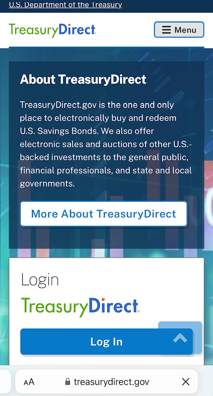
It’s probably worth a look for any of you who use TreasuryDirect on you phones.
What do you think?
Take a look around the new TreasuryDirect.gov and post your impressions in the comments section. If you find anything really new, interesting or helpful, let us know!
* * *
Feel free to post comments or questions below. If it is your first-ever comment, it will have to wait for moderation. After that, your comments will automatically appear.
David Enna is a financial journalist, not a financial adviser. He is not selling or profiting from any investment discussed. The investments he discusses can be purchased through the Treasury or other providers without fees, commissions or carrying charges. Please do your own research before investing.


They did reply and quickly, the next day in fact. However no illumination on what the future holds: Hello Matthew,…